Thursday 19 May 2011

What have you learnt about technologies from the process of contructing this product?


I have leanred alot about the equipment and computer programmes that I have used when creating this product. I have learned how to use a SLR camera and all of its gadgets and tachniwues. I have become very confident when using photosop to edit a layer. Also, I now know how to work Publisher when creating an intricate design. And finally, Internet Explorer has helped me broaden my knowledge of magazine informantion and research.

How did you attract/address your audience?

To attract and address an audience to my magazine I have used appealing, bold and embossed fonts. I have have also used bright and clear photographs and an intricate layout for the contents page to interest an audience.

Who would be the audience for your media product?

What kind of media institution might distribute your media product and why?


I think my magazine could possibly be distributed by 'Conde Nast' or 'National Mags' publications as they both distribute a wide variety of magazine genres. I would consider my magazine to be high in price and a high profile magazine which features popular musicians and the publishers above distribute high profile magazines like this. Seeing as the majority of the magazines that these two companies produce is Fashion, I think that there would be a niche in there for my indie rock magazine, as it is something that they don't have and could possibly make a profit from!

How does your media product represent particular social groups?

The artist pictured on the cover have similar poses, turning to the side and looking at the camera. The artists are quirky and edgy. The text and colour schemes are also similar, they are bold and will attract a young audience. The titles are also similar. Both of the images have been taken in a studio with bright lighting and simple angles. The artists both have seductive facial expressions, suggesting males may be interested in the magzine. And females may read it as they look up to the pictured artists.

In what ways does your media product use, develop or challenge forms and conventions of real media products?

The title of the magazine is very clear throughout the design. I had taken inspiration from other magazine titles such as 'Kerrang' and 'NME'. The fonts are bold and embossed so that they stand out on the cover. I also used a similar colour scheme to these designs in my title to ensure readers would have an idea of what genre the magazine is.
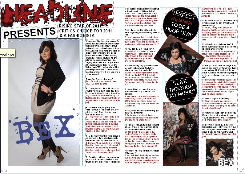
The images used throughout my design are all studio based locations apart from the image taken at a live musical event. Some of the images have simple backgrounds such as the plain studio backdrop, whereas other images have decorative backdrops.All the people photographed in the design are wearing dark clothing which again suggests that my magazine is meant for young and 'indie' teenagers. I have used a guitar in one of the images to emphasise the musical background of the image and the artist photographed is holding it asif to hit the camera. This suggests a rebelious and energised artist which will appear to a younger audience. I have a variety of gender shown in my magazine as there are both males and females photographed in the design. This should make the magazine appeal to both sexes.

The written content featured in my design should also appear to a younger audience as I have written in an informal style with lots of jokes and slangThe red and black colour scheme of my magazine matches that of existing magazines in the 'indie/rock' genre. The fonts used on the cover of my magazine should also attract a young audience as they are modern, edgy and bright.

<<< This is the layout design for my front cover, it is pretty simple and follows the usual conventions of magazine covers.


Double Page Spread: Final Design..

Above is the final design for my double page spread: