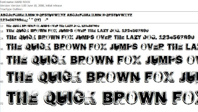
I then opened Photoshop and created my heading. I put it in quotation marks to indicate that my artist said this. I made the word "ROCK" bigger than the rest of the heading and in deep red to grab my audience’s attention and make them want to read on. The rest of the heading is in white to stand out from the dark background. I also put it on an angle like my main image to give it a quirky and edgy feel. Here it is:


I also needed to create a title for the page, so the readers know exactly what section of the magazine this is. In my contents I placed the "News" section right at the front of the magazine, which is where this article would fit in as it is the most important feature of the magazine and a cover feature. I noticed most magazines tend to put the title in the top left corner in small so it is not distracting. I decided to do this with mine too. I used the same font from my heading to tie it in and I also put the word 'NEWS' in the same deep red colour. I also added a link to the website as my target audience is likely to spend a lot of time on the internet. This small tagline reads "Visit volume.co.uk for the latest exclusive music news daily'. I put this in white capitals in a plain arial font to keep it small but noticeable. I then put the whole thing in a black box with a white outline so it stood out. Here is the finished title:
I then placed both these features onto my double page spread. Here is my double page spread so far:


No comments:
Post a Comment