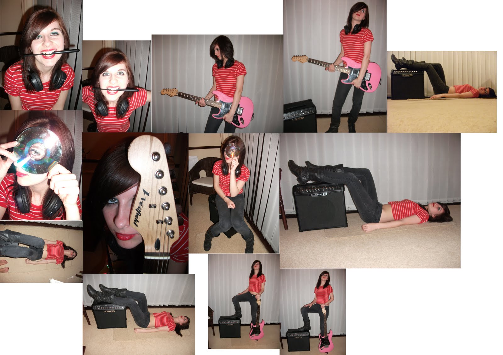

As you can see I took quite a lot of photographs, which meant I had a lot of choice with which images I wanted to put on my double page spread. First I thought that I would chose my main image as this would be one of the largest parts of the page, and my text etc. would have to fit around this. Here are 3 images I thought may work the best as a main image:
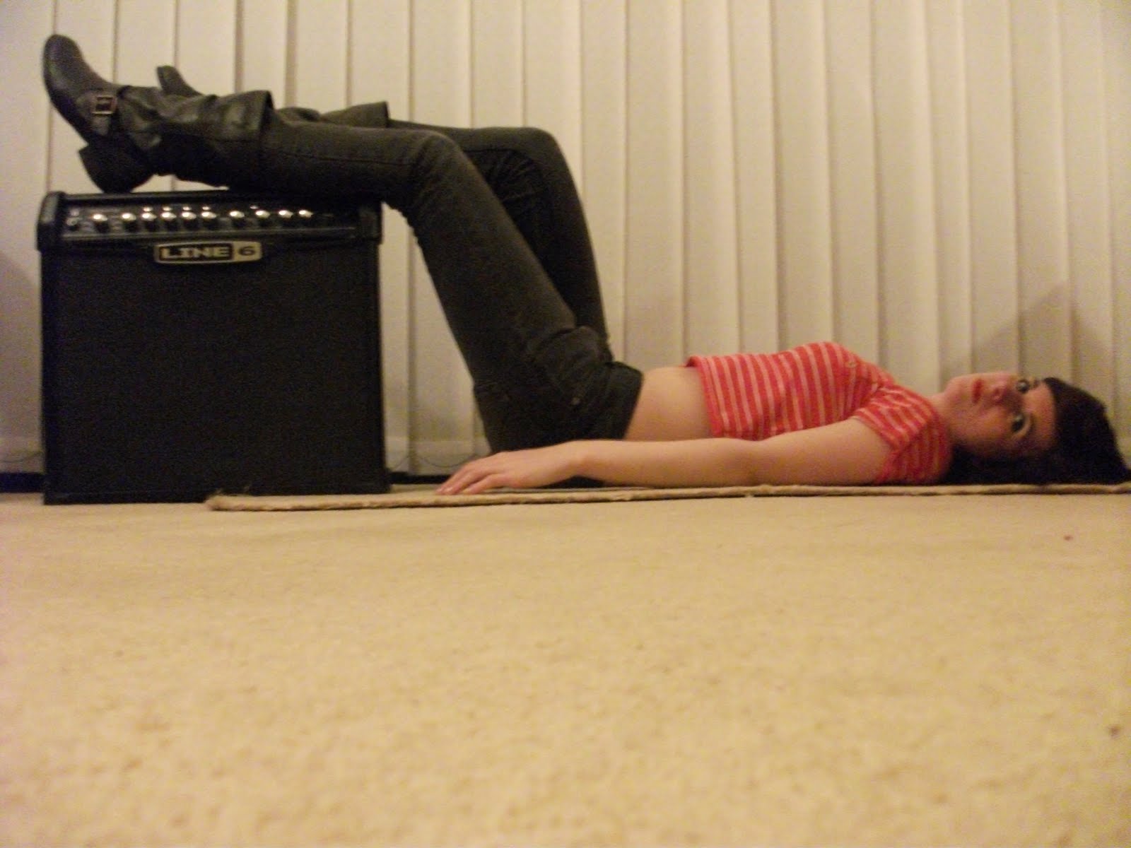
I like the point of view shot used in this image, as it is on level with my model making her connect better with the audience. I also like the incorporation of the amp prop, as flows well with the image with Ashley lying her legs across it. Although I like this picture, I think I could use a better one as I do not think it will fill up enough of the page to look bold and stand out. I also think that her face is quite blurred, which would need to a be a main focus of the image.

I think this image is much better than the last, the addition of the electric guitar connotes rock even more, and her pose is strong and bold. I like this image due to the positioning of my model. You can see her whole body which would allow me to change and crop the image as much as I needed to. Her facial expression is also very strong, and she looks rebellious much like the music genre of my magazine and she looks quite serious much like the story is. The only problem with this image is again, it would not take up much of the page as it is a long shot including her whole body, which would then make the image look more weak despite it being a bold pose.

I like this photograph due to the overall 'rebel' feel of it. I think this image is perfect for my double page spread. We can still see the guitar and amp included to connote rock music, yet they do not distract from the rest of the image as they are cleverly placed as they are still in the image but do not overpower the model or distract the audience from her. Her facial expression is perfect, as it is not too hard but still says that she is rebellious. The positioning of the photograph is also good, as it will take up a good size of the page and fit into the left hand side of the page, which is where I planned to put it. It will take up a lot of the page but leave enough too add my title and text and other features. This will be my main image.
No comments:
Post a Comment